Typography Poster
Brief
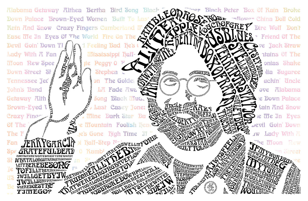
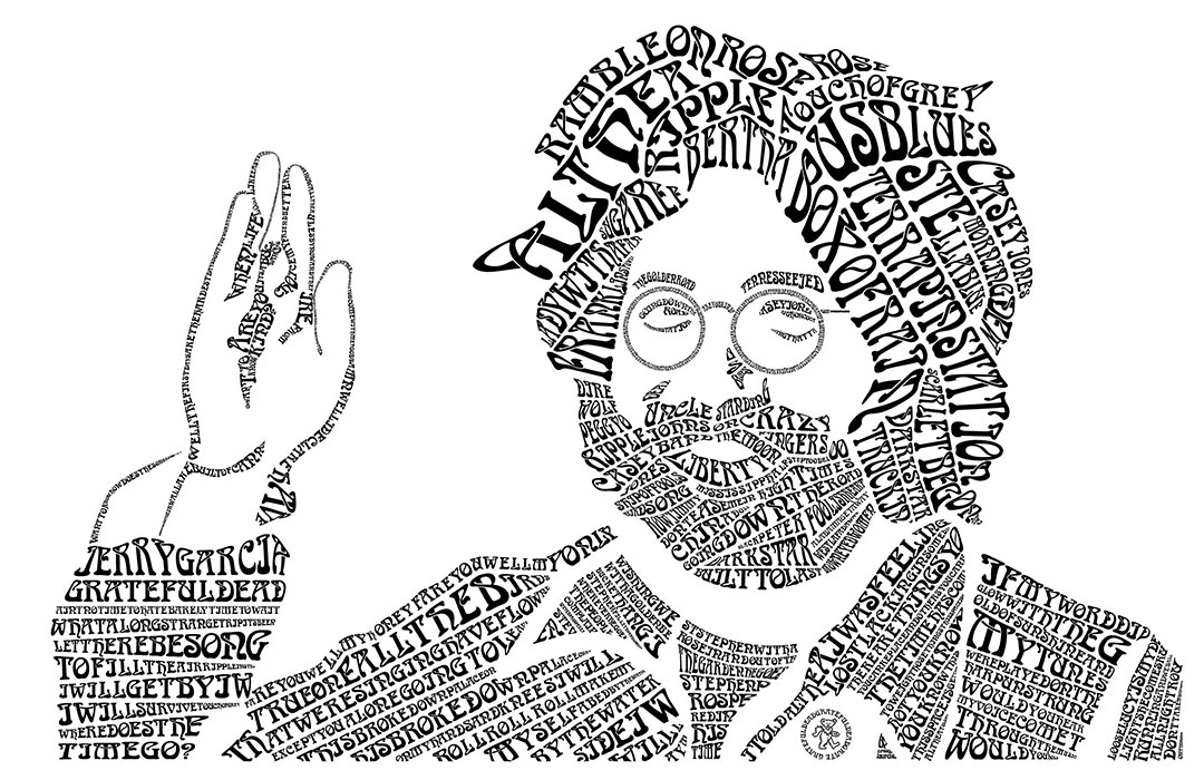
I designed a portrait of a famous musician, Jerry Garcia of the Grateful Dead, using only words and a single font. The font reflects the personality of Jerry Garcia and sets the tone for the image design. The words that make up the shape of Jerry Garcia consists of song titles and lyrics. Even the dancing bear on Jerry’s coat is made of only letters and words. The target audience for this project is Deadheads and fans of the Grateful Dead.


Details
Font Representation and Rationalization
The celebrity I selected is Jerry Garcia, the lead singer and guitarist of the Grateful Dead. The band became famous during the late 1960s when the psychedelic movement and “Summer of Love” produced music festivals like Woodstock, and the Grateful Dead’s style of eclectic, free-form music drew huge crowds. When I toured with the band in the 80s and 90s, the feeling in the crowd still embraced peace, fun, and love for your fellow Deadheads. Everyone was a big, happy family. To represent this feeling, I searched for a font that flowed and was, for lack of a better term, groovy, like the 60s music scene.
Use of Type to Engage Audience And Gain Visual Interest
To create Jerry Garcia, I initially used upper- and lowercase lettering. I found the differences in height values created too much white space and became distracting. I switched to all capital letters, using the same font height throughout the face, hair, and beard. This approach made everything look the same and did not create a visual hierarchy or visual rhythm. I tested a few words in a grey hue to represent grey hair, but the different colors made the words stand out more and produce an unintentional visual hierarchy. Instead, I decided to create various sizes of words and letters. By varying the size and shape of letters and line-height, I produced dark and light areas in the image, giving it a textured look. The smaller words also draw the viewer’s eyes around the image.
A few areas use the curves of the letters to fill in hair curls, or points in the design. An example is the word ALTHEA in the hair. The swoosh in the A represents a curl of the hair. The same is true for the words TOUCH OF GREY, where the warped Y represents a wisp of hair.
A prevalent iconic symbol of the Grateful Dead is the dancing bear. The bear is rumored to represent Jerry Garcia, whose affectionate nickname was Papa Bear. To incorporate the icon into the image, I created a bear shape out of the words “Jerry Garcia” and used letters for the eyes, mouth, and decorative details. The image is exceedingly small, so it initially looks like a line drawing, but upon closer inspection, the viewer notices the words making up the bear.
Summary
This project started as a frustrating assignment but ended up being a project of love. It took me six weeks working at least four hours a day, often more, to complete the project on time. I had many hours learning how to use the tools and making many, many mistakes along the way. The experience I received through this project was invaluable. As a perfectionist, I see many areas I would improve if I make another image.
Tools


Typography
Boecklins Universe
Got some things to talk about, here beside the rising tide
Come on along, or go alone, he’s come to take his children home
ABCDEFGHIJKLMNOPQRSTUVWXYZ
abcdefghijklmnopqrstuvwxyz
1234567890!@#$%^&*:”