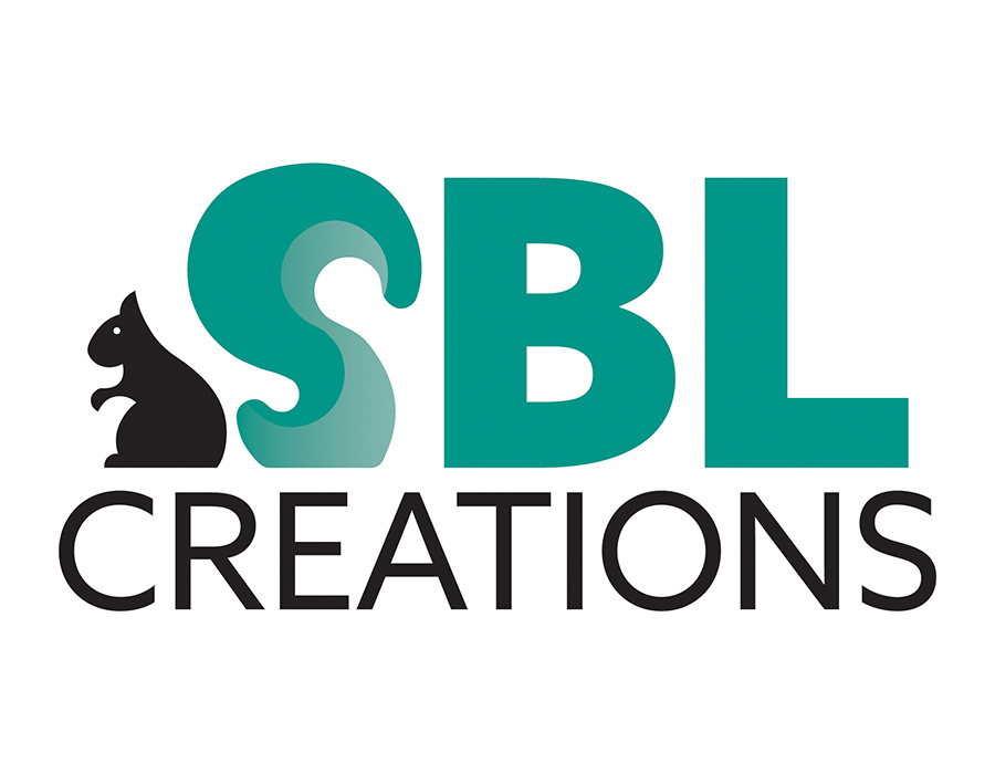
Logo Design – SBL Creations
Brief
SBL Creations is a family-oriented business producing quality hand-crafted squirrel and other backyard critter feeders and furniture. Their designs include bird, squirrel, and
chicken feeders that are attractive and
functional.
Details
The letters SBL represent the names of the founder and his children and grandchildren. During the pandemic of 2020, they used their downtime to create cute furniture for their backyard squirrel friend, Milo. The antics of the backyard pets led to more creations and family fun.
Color
The client wanted a vibrant color palette. I thought of the outdoors and nature-themed products and came up with a mountain sunset palette. I offered the client several options, including orange and yellow to represent the setting sun. I also included blue and green to represent the sky and trees. I started with muted colors but offered the option to brighten the colors. The client chose the green option to symbolize nature and the outdoors (plus, his kids love the green choice!)
Typography
Through the questionnaire, the client expressed his preference for thick, block-type letters. I chose Azo Sans for the clean geometric lines that also have some humanistic quality. After offering several typography options to include script and decorative typefaces, the client decided on the simplicity and easy readability of the sans-serif font.
Logo
After looking at many squirrel pictures for inspiration, I started seeing an “s” in the tails. Using the golden ratio, I created the “s” to look like a squirrel’s tail. The gradient in the tail breaks up the solid color and adds dimension to the design.
Brand Manual
Tools


Typography
Azo Sans Black
The day the squirrel went berserk
In the First Self-Righteous Church
In that sleepy little town of Pascagoula
ABCDEFGHIJKLMNOPQRSTUVWXYZ
abcdefghijklmnopqrstuvwxyz
1234567890!@#$%^&*:”


