Flyers
Brief
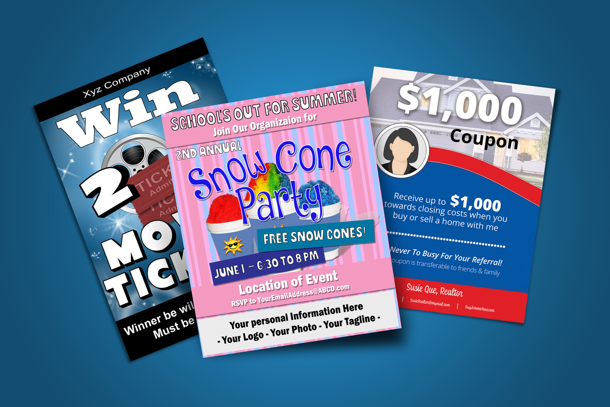
The goals for the flyers varied according to my customers. Mainly, they wanted to promote themselves, their business, or an event.
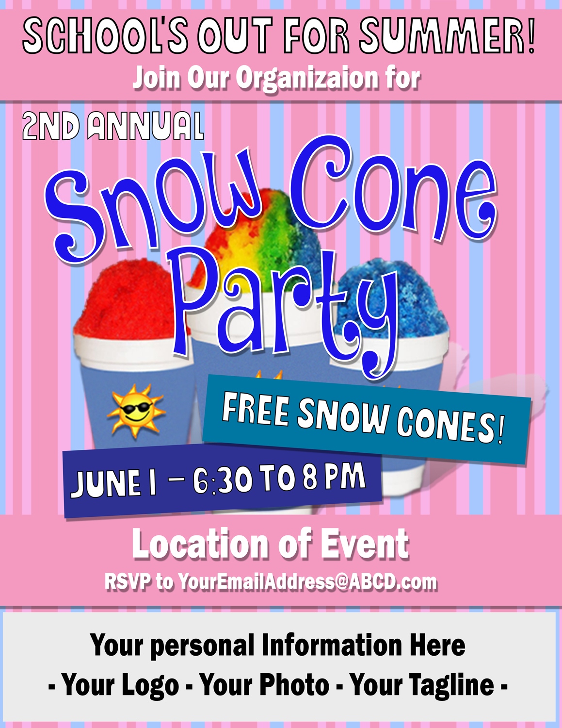
Snow Cone Party
The goal was to communicate the event to the community. I used old fashioned, 1950s ice cream shop colors as my color palette to give a bit of nostalgia and a relaxed, fun feeling. The flyer was distributed to a community, and the event was successful.
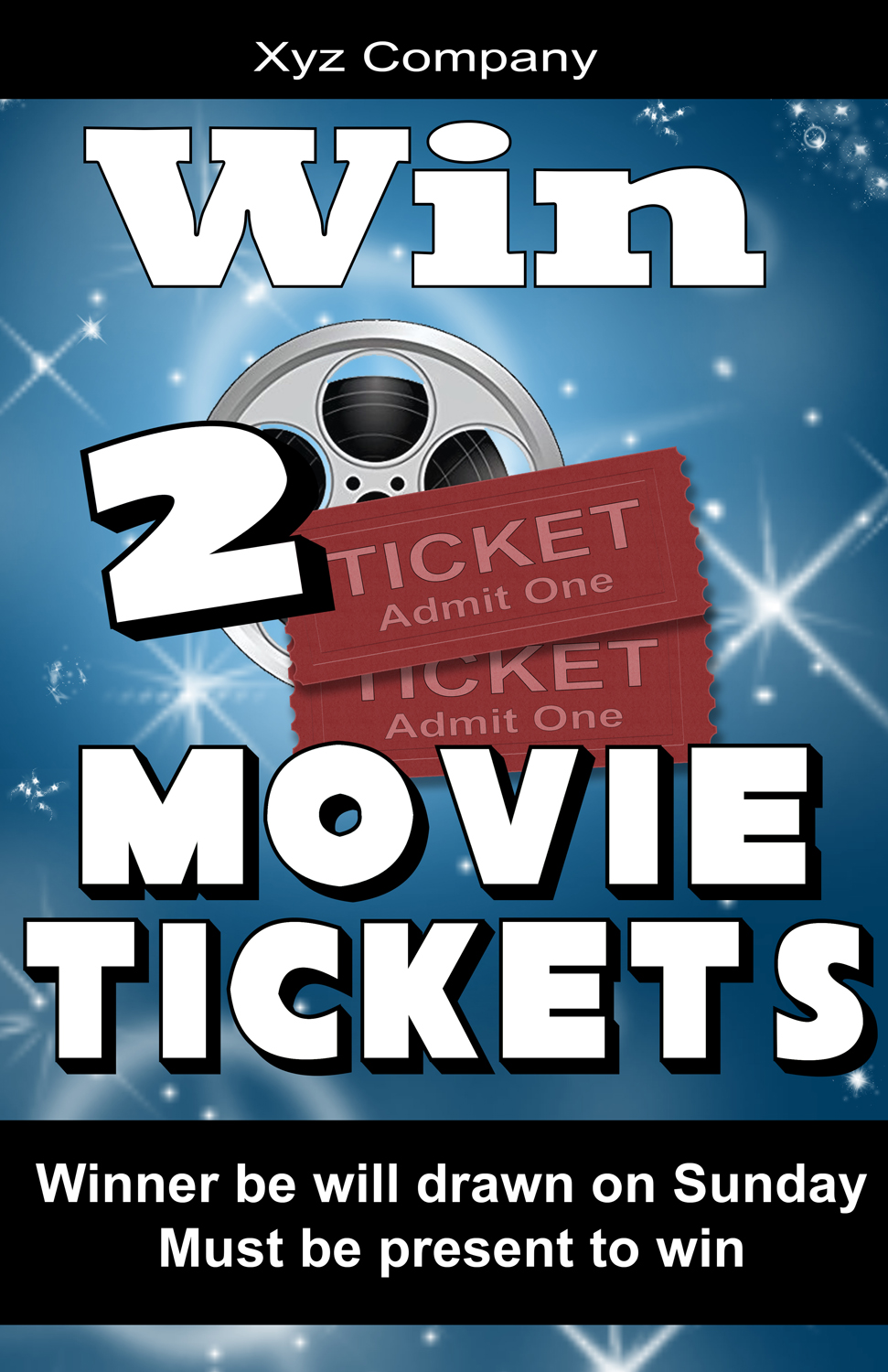
Movie Poster
This goal was to up-sell. The poster has sparkling lights in the background to mimic camera flashes as stars walk down the red carpet. The text is large and contrasts against the darker background.
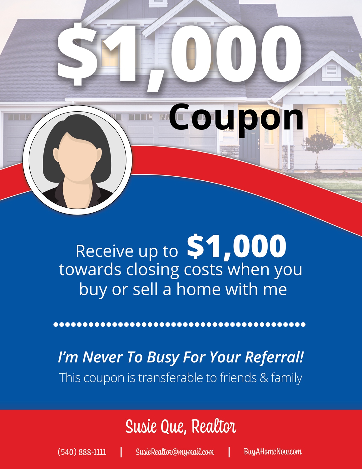
Realtor Coupon
Coupon uses the company’s color palette and incorporates soft lines and circles like their balloon logo. The typography matches the company sans serif font with the Realtor’s information in their personal font style. This coupon was used in the Realtor’s seller packet.
Description
Snow Code Party
The customer wanted to communicate an event to bring the community together. Living in a large town, I thought of when towns seemed small and people were neighborly. My first thought was Mayberry and Andy Griffith. I looked through old-fashioned ice cream parlor pictures to chose my color palette. I found several images from the era that used stripes, so I incorporated the idea into the flyer. I found typography ideas from the same research.
Movie Poster
This advertisement’s purpose was to up-sell items at a restaurant/bar. More information can be placed in the black sections on the top and bottom. With a few seconds to grab a customer’s attention, I made the main point of winning the poster’s most prominent element.
Realtor Coupon
I used the colors and shapes of the company logo as inspiration for this coupon. Using the information provided by the Realtor, I draw the viewer into the coupon with the large dollar amount and draw their attention down the page by using different colors, font weights, and sizes.
Tools
