Font Poster – Boecklins
Brief
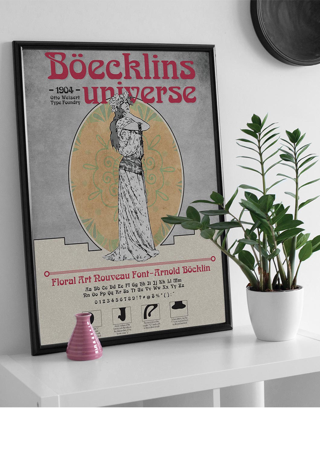
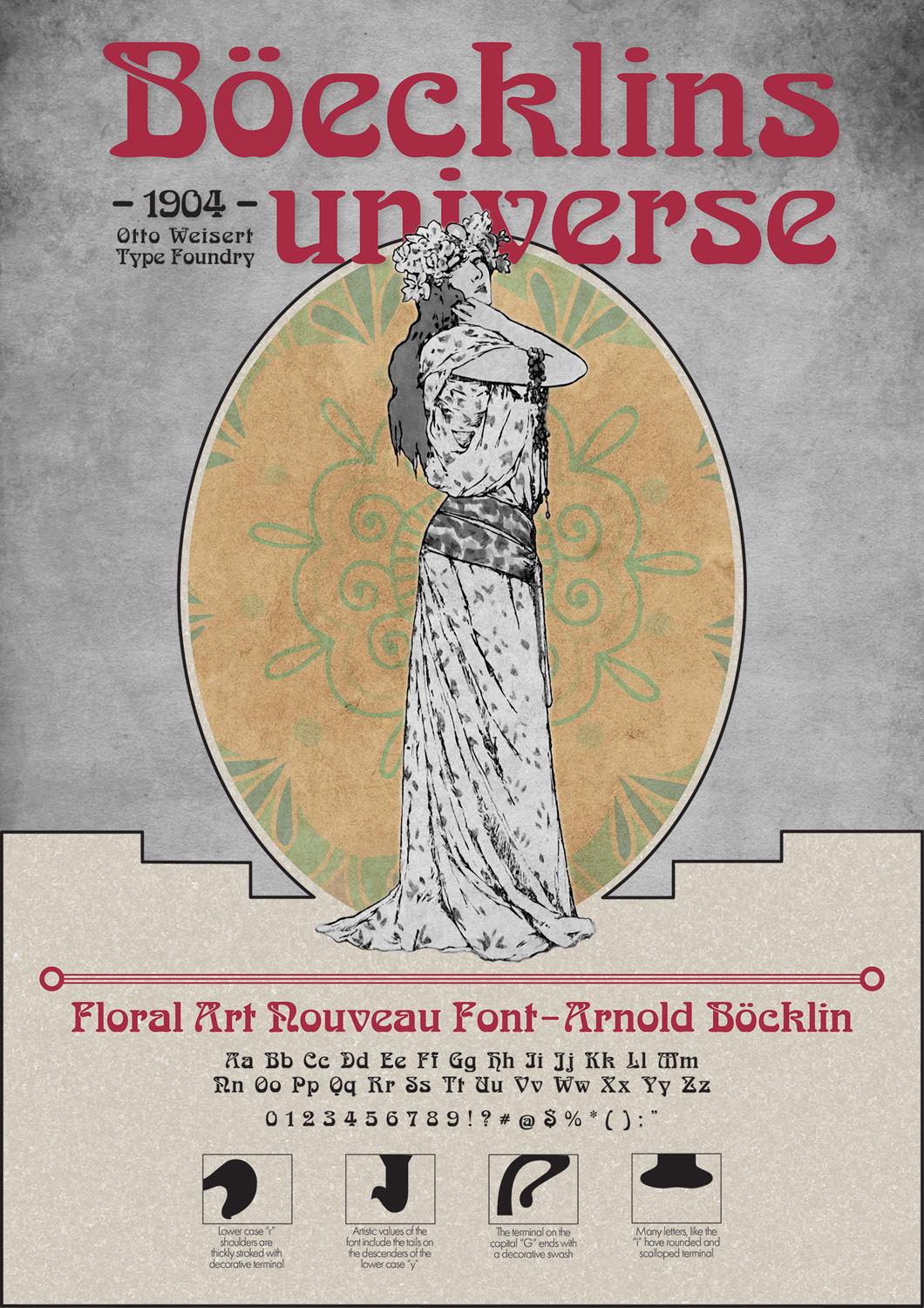
My goal was to create a typography poster featuring Boecklins Univers typeface. The art nouveau period inspired the font. I made a poster with a look and feel of the period and includes a brief history, characteristics, and font features.
Details
The posters I researched have many ornamental details and textures, including natural forms and curves, plants, and flowers. Most of the posters include a beautiful woman in flowing dresses. I wanted to have both the subtle textures and female image in my sign without overpowering the typeface’s name. To allow the red type to stand out and become the focal point, I chose neutral colors for the backgrounds. A few key facts, along with font characteristics, round out the informational poster. The font’s name is Boecklins Universe and is spelled differently from the original creator, Bocklin. This difference may be due to licensing issues and is not a misspelling on the poster. I visualize this poster used in a classroom or office setting.
Tools


Typography
Boecklins Universe
Lose your grip, you’re falling fast
You wake up with your minds aghast
You see a ship go floating past
Count your fears when they walk in the door
ABCDEFGHIJKLMNOPQRSTUVWXYZ
abcdefghijklmnopqrstuvwxyz
1234567890!@#$%^&*:”


