
I loved this class. It was out of my comfort zone and challenging. It was the only class taught with videos, so it felt like I was in an actual class. I wish we had a part 2 class. Not sure how it would help with graphic design, but it would have been fun!
Line and Balance Project
The first project was to construct a wire sculpture of a human figure in action (sports theme) using asymmetry balance.
My Post:
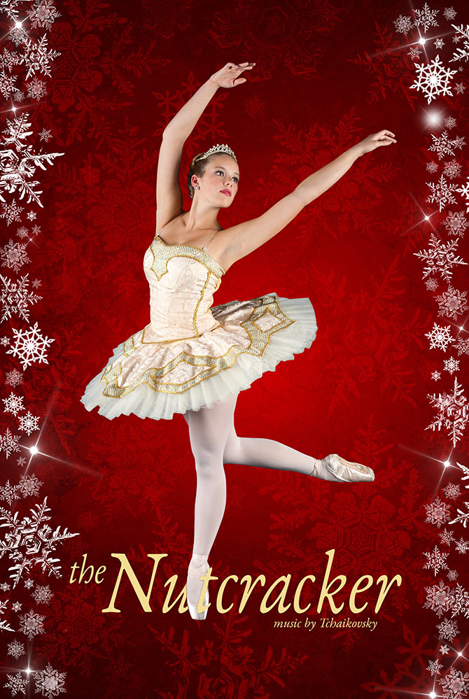
The action figure I used is a ballet dancer from the Nutcracker. I saw the play for the first time last year, and the pure strength and grace needed to perform ballet amazed me. I chose the ballerina in what looks like a standard pose with her arms gracefully poised over her head and her right leg bent while balancing her weight on the toes of the left foot.
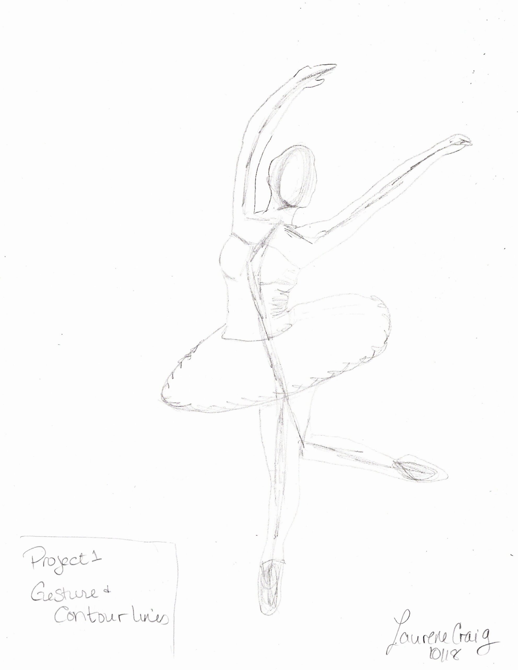
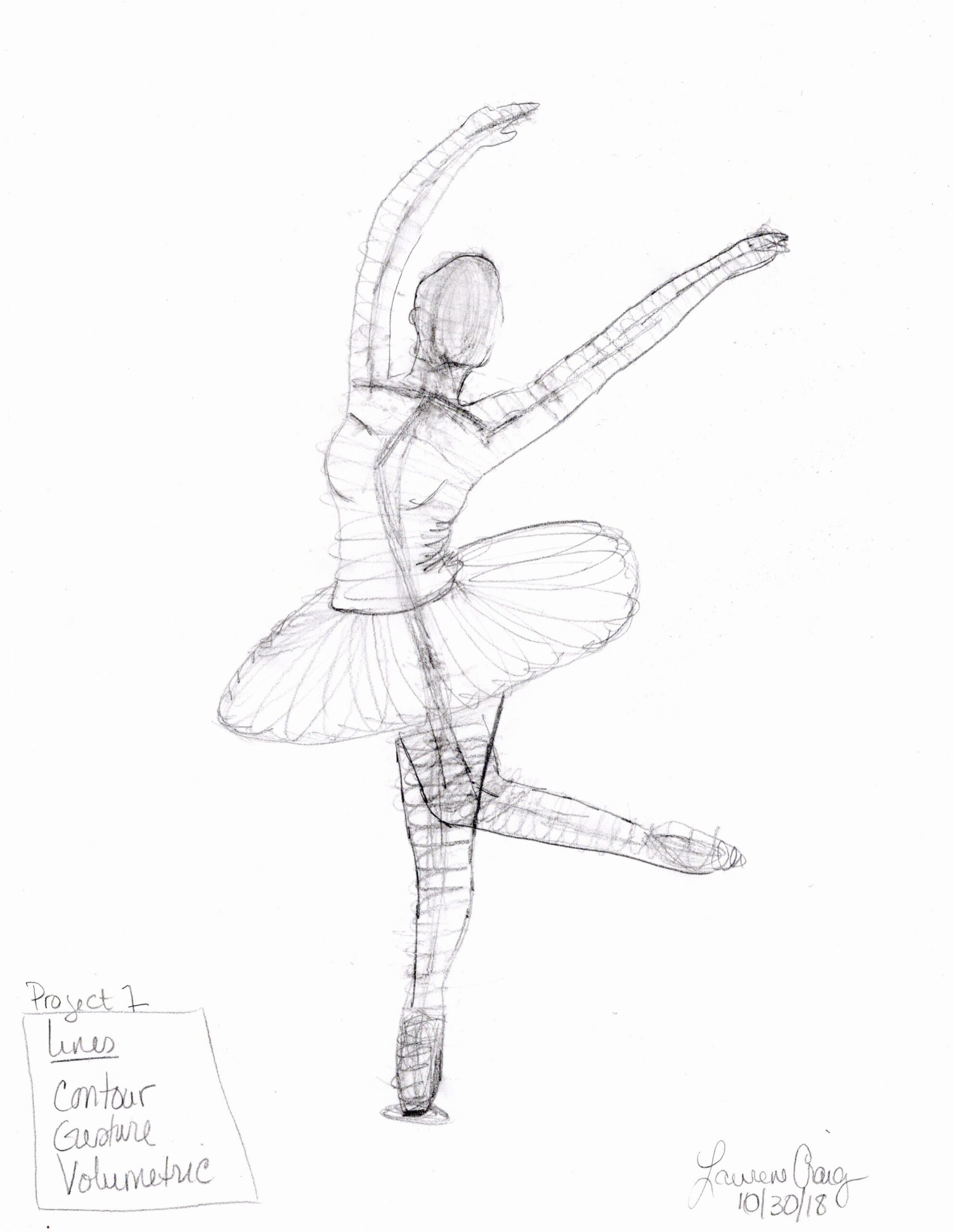
To compose the initial concept drawing, I started by using contour lines. The ballerina’s torso was bent back slightly, and the contour helped me define the bend at her shoulders and waist/chest area. I then quickly drew gesture lines to determine how I would create the foundation for the sculpture. I finished by using volumetric lines that helped with the placement and size of the tutu.
I believe I successfully expressed the internal movement lines in my action figure because when I first started, I thought the one-point contact of the foot would make the figure unstable. However, following my gesture lines and creating a circular coiled base smaller than a penny, I was able to stand the figure up, and she rarely fell over. The most challenging part of the sculpture was the tutu. I tried three different gauges of wire and tried four versions. I found the thicker wire to very spring-like, and my tutu ricocheted off the table, wall, and floor, making it a great cat toy. I settled on the 20-gauge wire but could not find a perfect way to make the loops consistent while making the coils stay in the same position around the skirt. Overall, I like my first attempt at wire sculpture.
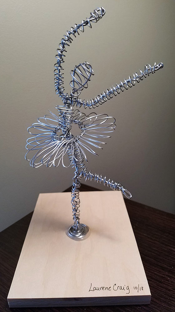
Grade: A
Cardboard Robot
I created my three-dimensional robot out of white poster board and mounted him on a foam board. The robot is about twenty-three inches tall. I began by sketching four different robot designs. I chose the three-face design because it incorporated both rectilinear and curvilinear planes. I did not include too much texture in the drawings because I was unsure what personality the robot would have when complete. Creating the boxes was straightforward, but the measurements required precision for them to fit together correctly. I remade many of the boxes several times to get a good fit. I found the poster board was not very bendable when creating the cone or cylinder shapes, even when wrapping the poster board around a form.
The robot’s body consists of square and rectangular boxes, cylinders, and cones. My favorite component of the robot is the changing face. The faces are basic Lego style of happy, sad, and angry expressions. I originally made his arms movable by attaching the upper arm boxes with brads, but the weight of the lower arms did not allow them to stay in place. Applying the principle of “honesty of materials,” I painted all my details and texture white. The rivets are painted brads, and the ears and the rivets on the bottom of his lower body are painted button covers. His fingers are painted pieces of wood. I added the rectangular section on the bottom of his face to add more dimension, like a chin. I created additional decorations to create more texture, but I like his simplistic design.
Overall, I am pleased with the way the robot turned out. If I had more time and patience, I would make the boxes a little better and create smoother cones for the arms.
PDF file with drawings: craig_project2_arts114
Grade: A
Subtractive 3D Tile
Unfortunately, this project cracked 🙁 But I still received an A
My Discussion Board Post:
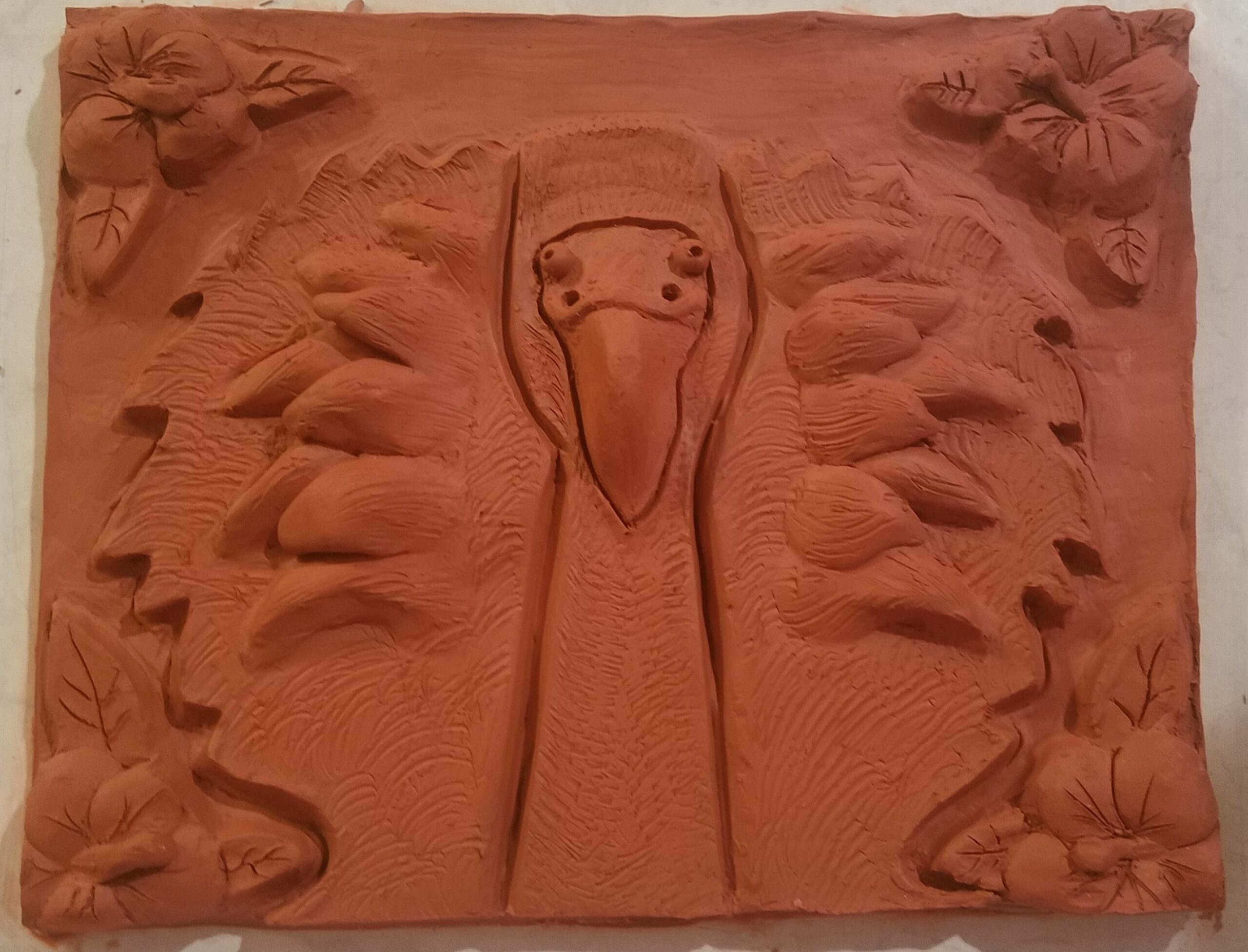
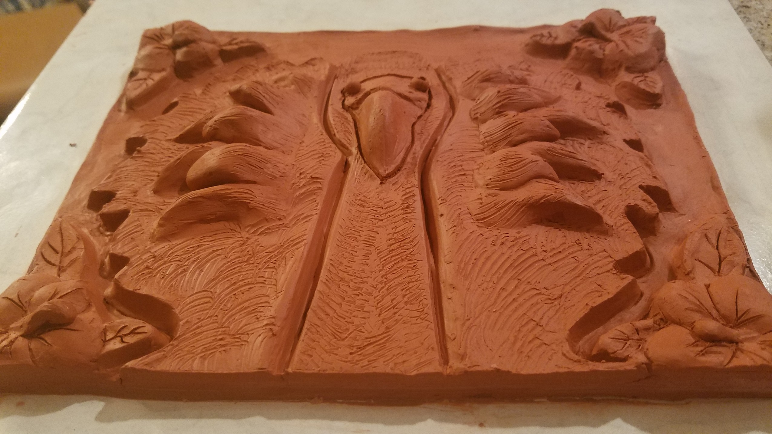
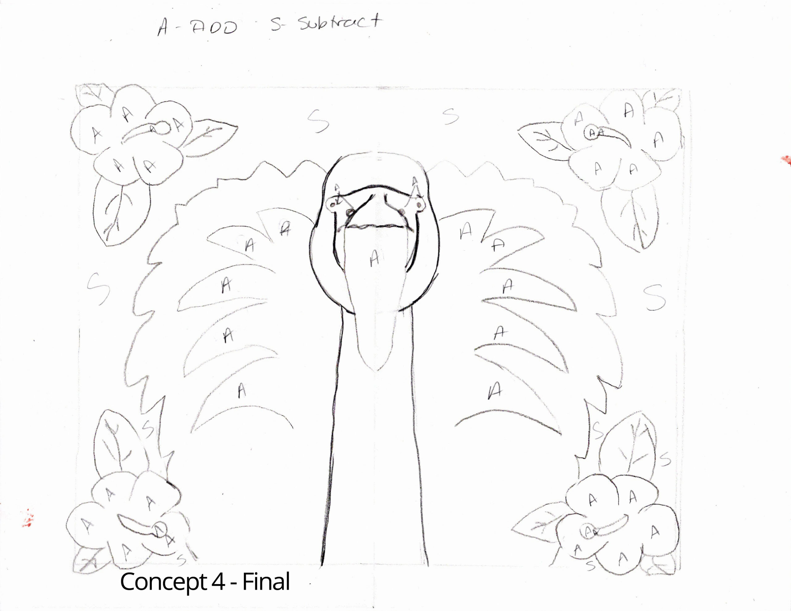
For my clay tile project, I started by drawing geometric shapes randomly on a quarter of a piece of tracing paper. I copied the shapes to the other three corners. The designs I created were interesting, but they did not impress me. I wanted to create something that I could display and enjoy viewing after the end of the course. Since my office has several flamingo pictures, I decided to do a tile with a flamingo. I used a balanced view of a front-facing flamingo with fluffy feathers surrounding his head and added hibiscus flowers to the tile’s corners. I made each corner a mirror image of the other flowers by folding the tracing paper in half and tracing the original design to the four corners. I then transferred my design to the clay. I used red pottery clay, and I found it challenging to work with at first because it was very soft. I did not have several hours to let the clay harden a bit before sculpting the details until Wednesday, but once some of the moisture evaporated, it was easier to create the definitions and touch up the design. For the subtractive layer, I removed the clay around the outside of the flamingo and the flowers. The original layer consisted of the flower leaves, the head, neck, and outer body of the flamingo. The additive layer included the beak, feathers, and flower petals. I’ve included my drawing that labeled my initial ideas for the three layers. If I did this project again, I would leave an outer edge to frame the tile. I had a difficult time keeping the subtractive layer even in height, and I think this edge would help make the subtractive layer even. I would also use a ruler to have a more precise depth for the entire subtractive area. I finished the tile late Wednesday night, and I don’t believe it is fully dried. When it is, I think I will paint the tile to give it more character.
Project Details: Craig_Project4_Arts114
Grade: A
Planar Reduction
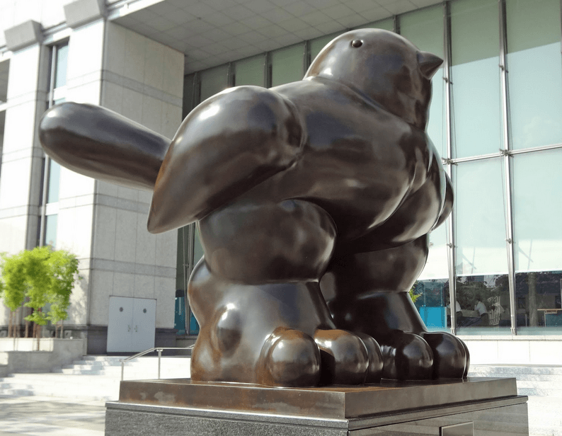
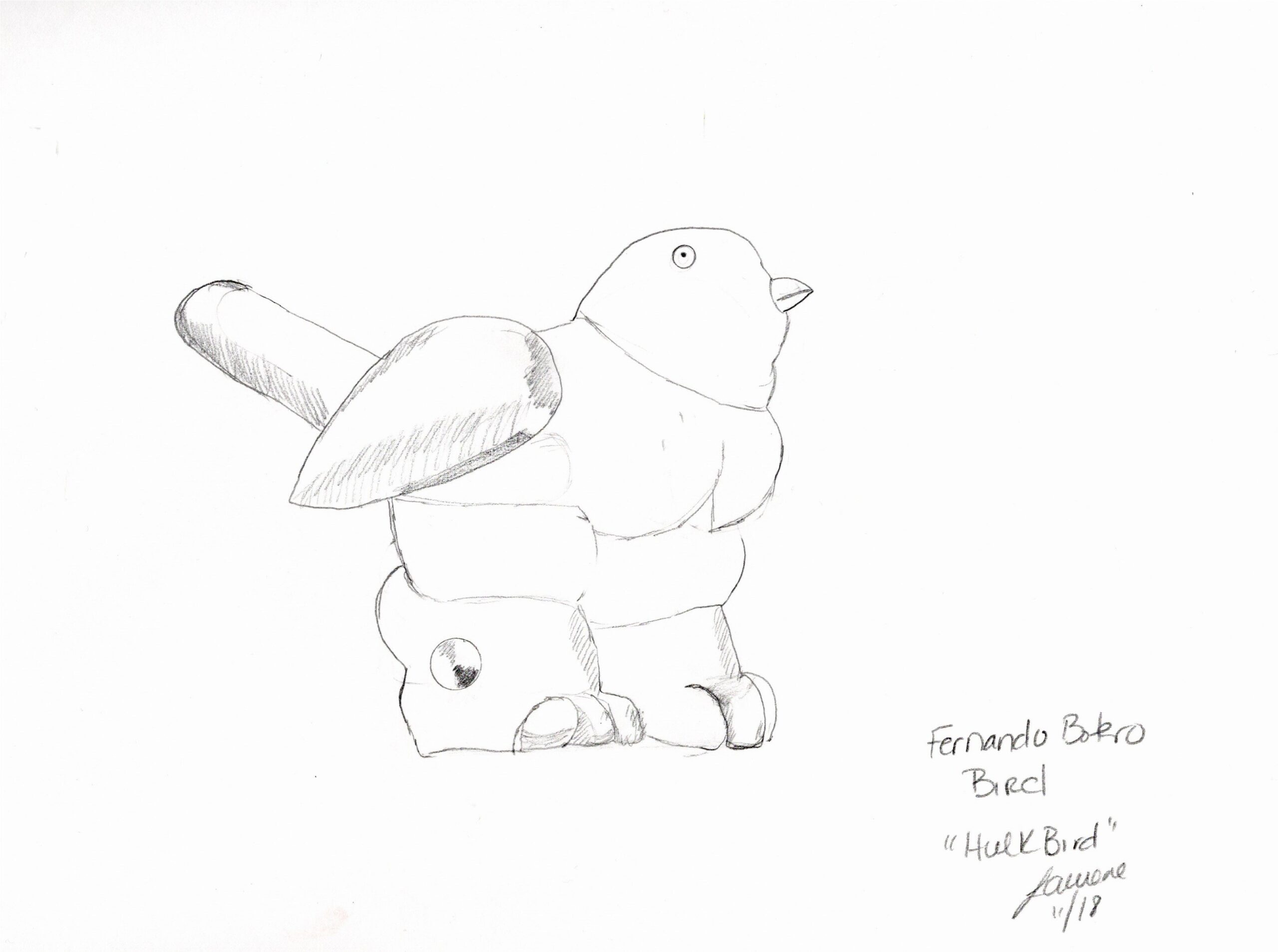
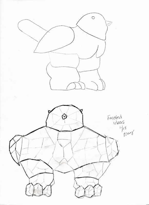
I copied Fernando Botero’s “Bird Of Peace” for this project. I like his sculptures because they depict everyday life objects in an exaggerated form. I think of this bird as “Hulk Bird.” My biggest challenge was balancing the enormous body on the legs. My initial design idea was to create two parts for the legs and have the front of the legs come up towards the breast, but my design was flawed, and the body kept sliding back. I now laugh at my design because I had it in my mind’s eye that the feather in the back was just one point, but after I finished and it was almost dried, I realized there were four or five feathers in the tail! It’s now my variation on the great master’s work.
In my faceted drawing, I made many more facets than I could have realistically created. Although it seemed like a reasonably easy task, the facets were a little challenging. I tried to create mirrored facets on each side of the body, but the more I tried, the more I made them different.
A few things I would have done differently include creating all of the tail feathers. In this state, he kind of looks like a cat, and I think I had Botero’s fat cat statue in mind while drawing my model. I originally was going to do the cat statue but opted for the bird. Also, I would have liked to create more facets, but I do not know how to accomplish this.
Overall, I enjoyed this project. I learned that the wet clay was rather forgiving. This may sound strange, but my epiphany was that I had to work the clay and be “rough” with it instead of letting the clay do what it wanted. If a piece didn’t go where I wanted, I had to force it there. Sculpey clay seems more finicky.
A funny side note – to dry the bird a little faster, I brought it inside from the garage and placed it by my goldfish tank. Our oranda goldfish, named Brain, loved looking at it. He swam around in circles and poked at the side of the tank. When I moved the bird to take pictures, Brain sunk to the bottom of the tank and hasn’t moved. I think I found the place to display Hulk Bird.
Grade: A
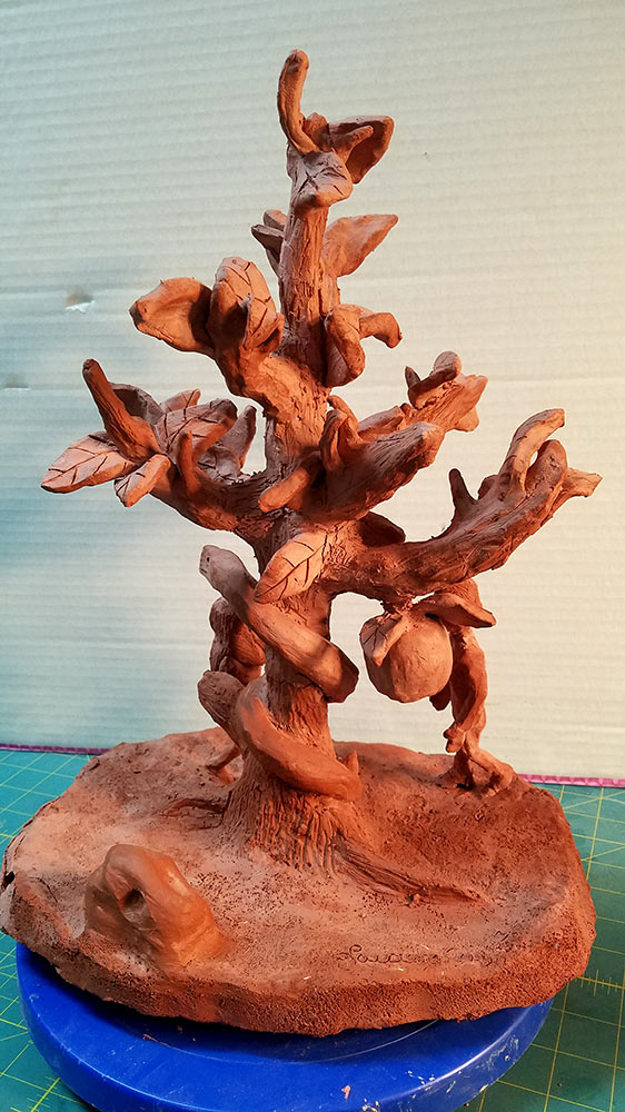
Emphasis Through Contrast In Size
Directions:
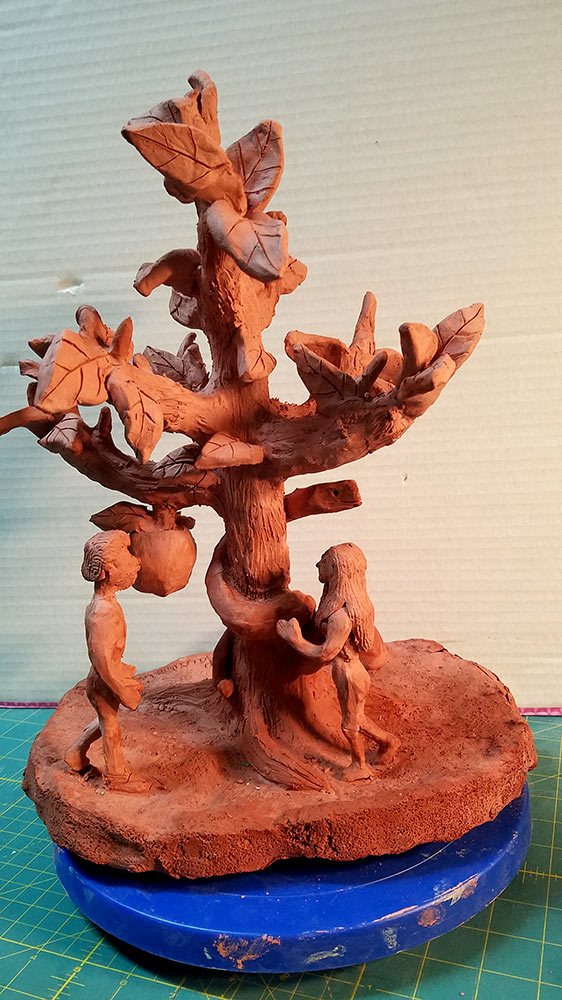
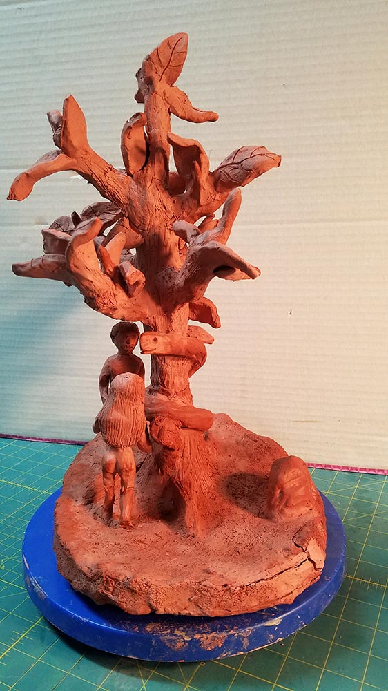
You will create an area of emphasis (dominance or focal area) in a three-dimensional design by contrasting the sizes of two distinct forms. This assignment will also emphasize the importance of trying to articulate a Christian worldview. You are encouraged to illustrate a Bible verse or character that incorporates a contrast between two ideas, personalities, or ways of believing. You will also learn how to create an armature when constructing a complex design using natural or synthetic clays.

Grade: A
Recent Comments